I’ve written tens (hundreds?) of thousands of words about the 2024 election. And you have read every single one of them.
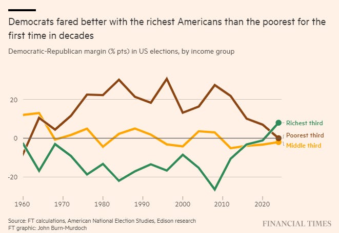
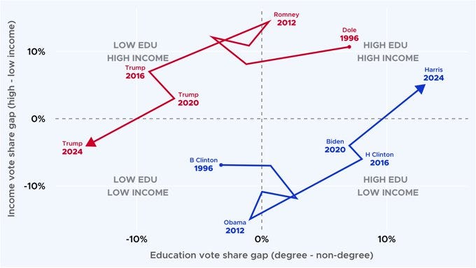
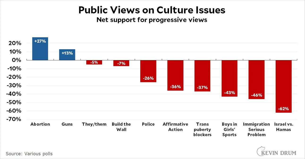
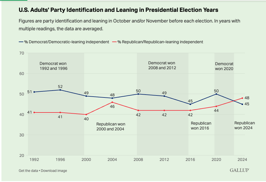
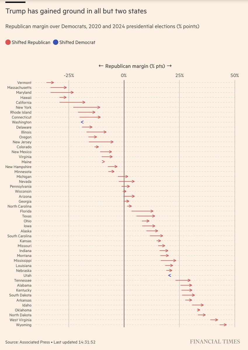
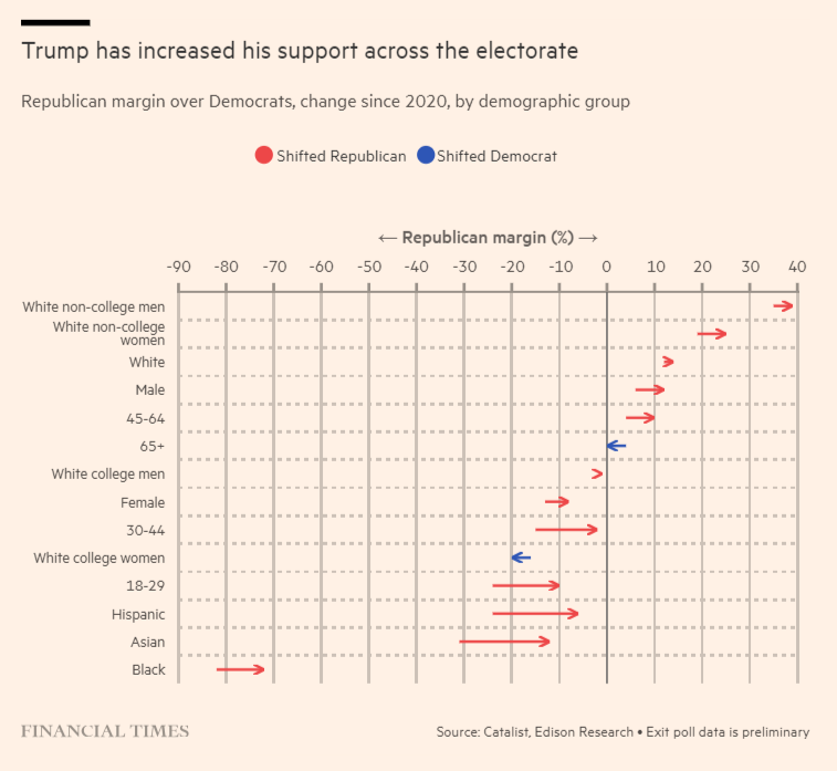
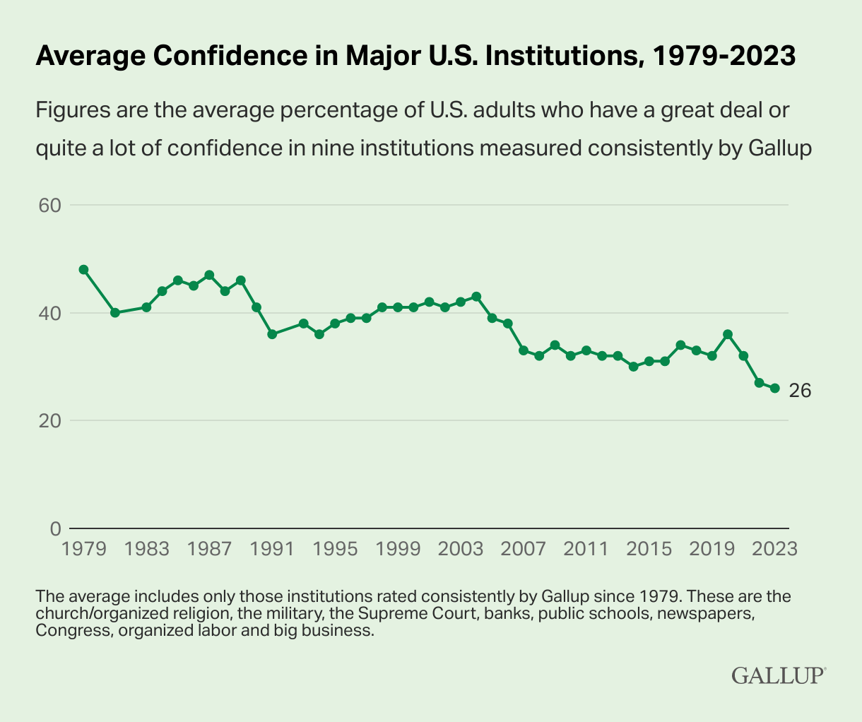
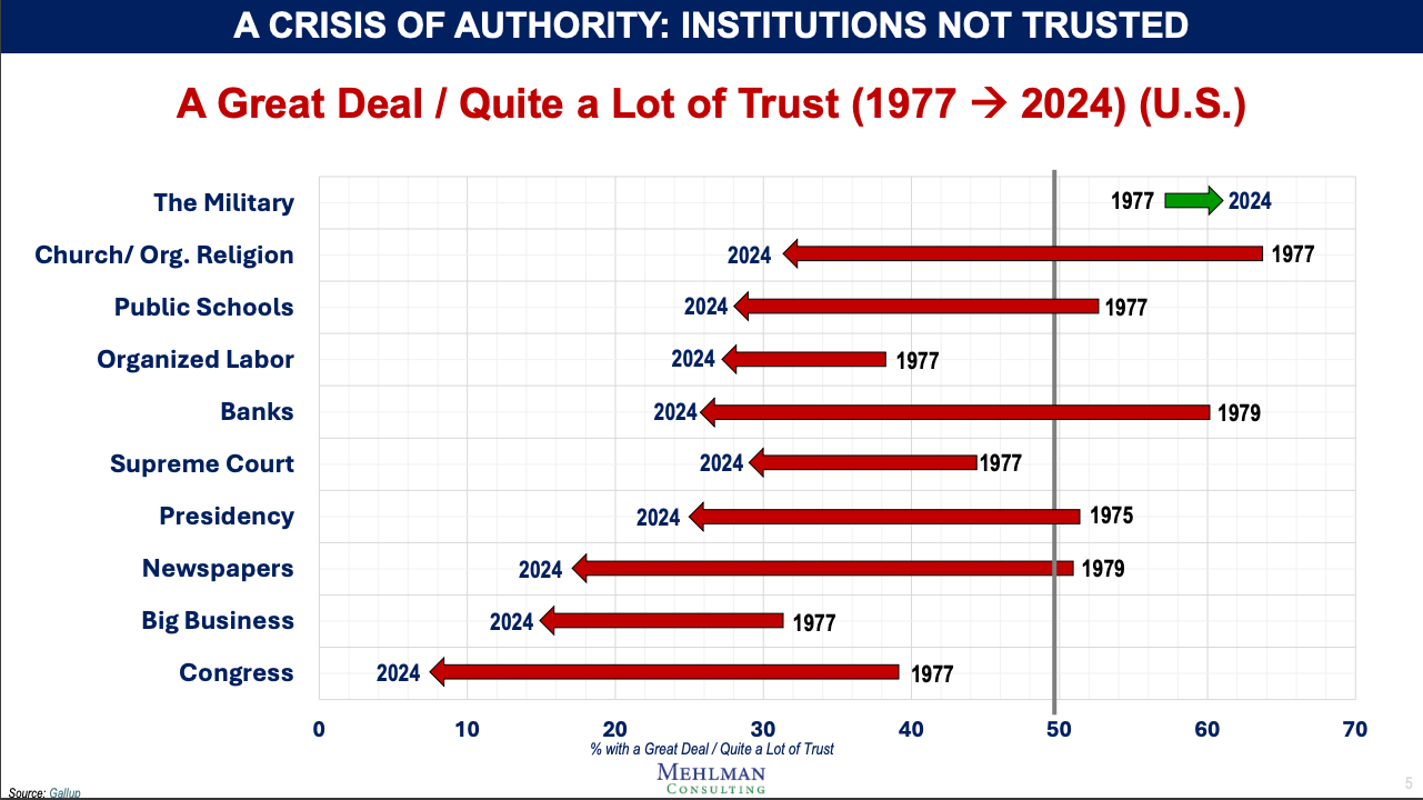
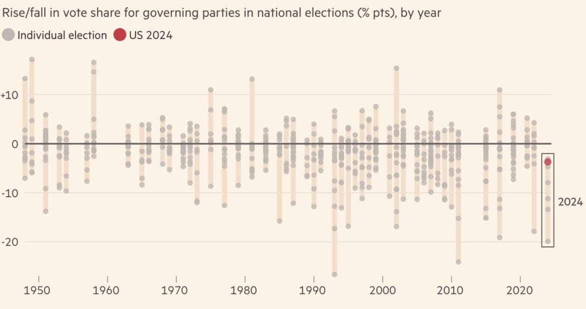
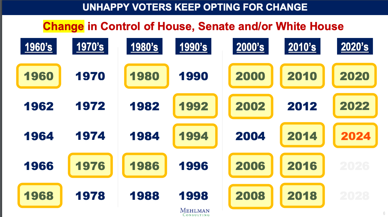
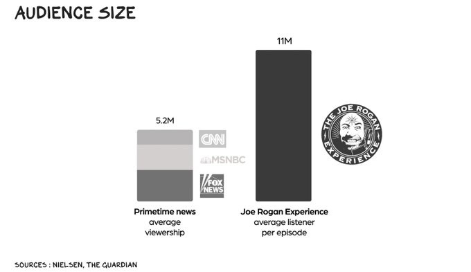
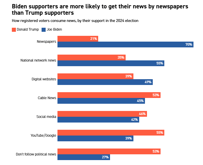
But, sometimes, words don’t do as good a job as a picture — or, in this case, a chart or a map — to tell the story of what really happened in the election and, more importantly, in the country writ large.
While I have been regularly posting some of my favorite election charts in this space since last week, I thought it might be a good idea to put them all in one place. Special shout outs to Bruce Mehlman, Bubba Atkinson and David Castagnetti — all of whom do GREAT work in the chart space.
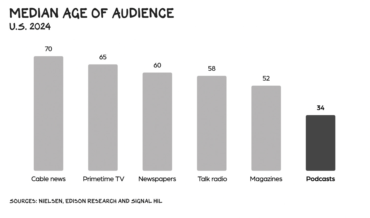
Below you’ll find the charts and graphs that I think reveal not just what happened in the race between Donald Trump and Kamala Harris but the broader landscape — political, cultural and media — on which this election was fought.
These charts are in no particular order. Each can stand on its own but, taken together, I think they tell a very powerful story about where we are and where we are going.
This post is FREE for everyone. But, I can only do this sort of work with your financial support. I hope you consider becoming a paid subscriber today! It’s $6 a month or $60 for the whole year!



What I get from these charts is: people are becoming more Republican leaning because they are misinformed and will continue that trajectory because they will continue to be misinformed. Great. You’re bumming me out Chris!
Trump won because of all of the things that were represented in those 15 charts. ANY Republican candidate would have won. And if the Dems want to right their ship, they should first concentrate on getting rid of the toxic, far left "progressive" wing of their Party. Those few dopes get outsized attention and provide jet fuel to the opposition.